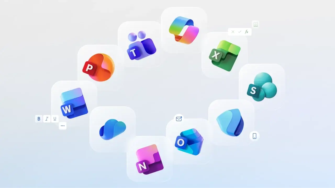
Microsoft has updated the icons for the ten main Office applications for the first time since 2018. This was reported by Zamin.uz.
This update was carried out to create a unified and modern look for the Microsoft 365 platform. The new icons consist of bright colored gradients, rounded shapes, and smooth lines, designed to simplify the interface and enhance user convenience.
According to Jon Friedman, Vice President of Design and Research at Microsoft 365, the new icons allow users to quickly and easily select applications. The updated design is inspired by the Copilot icon; for example, the Word icon has been simplified compared to the previous one — it now has three lines instead of four, which improves visibility on small screens.
The new icons will be rolled out on web, desktop, and mobile devices in the coming weeks. These changes represent an important step towards improving the visual system of the Microsoft 365 service and enhancing the user experience.


